Bratislava transit redesign
Unsolicited and guerilla redesign of a ticket machine UI
Try it yourself in a public Figma prototype →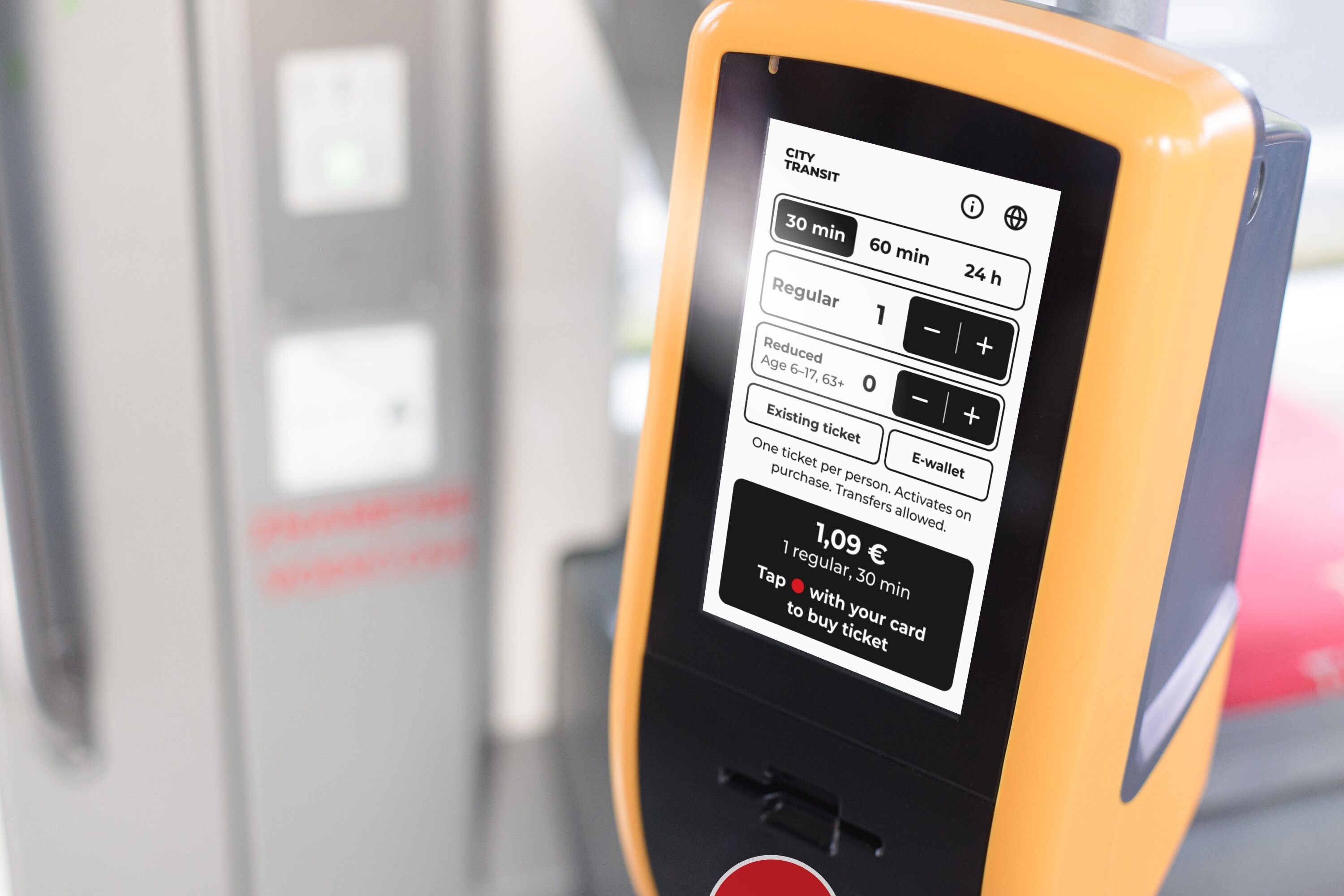
Bratislava's trams and buses have a contactless ticket machine on board. The idea is straightforward — tap your card, get a ticket, travel.
The experience is less straightforward.
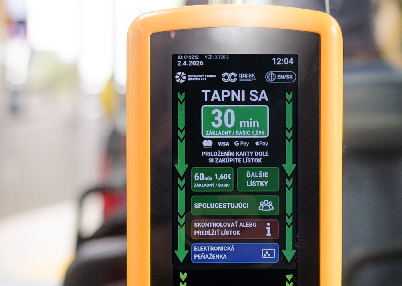
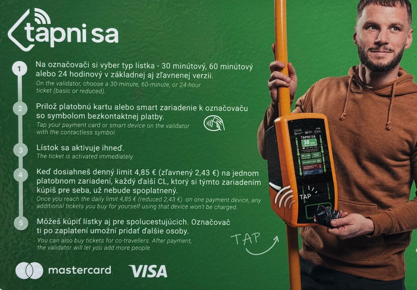
The interface was updated last year. The new version added more options, more colour, and more visual noise, along with a five-step instruction poster on the bus stops to help passengers navigate it.
The constraints
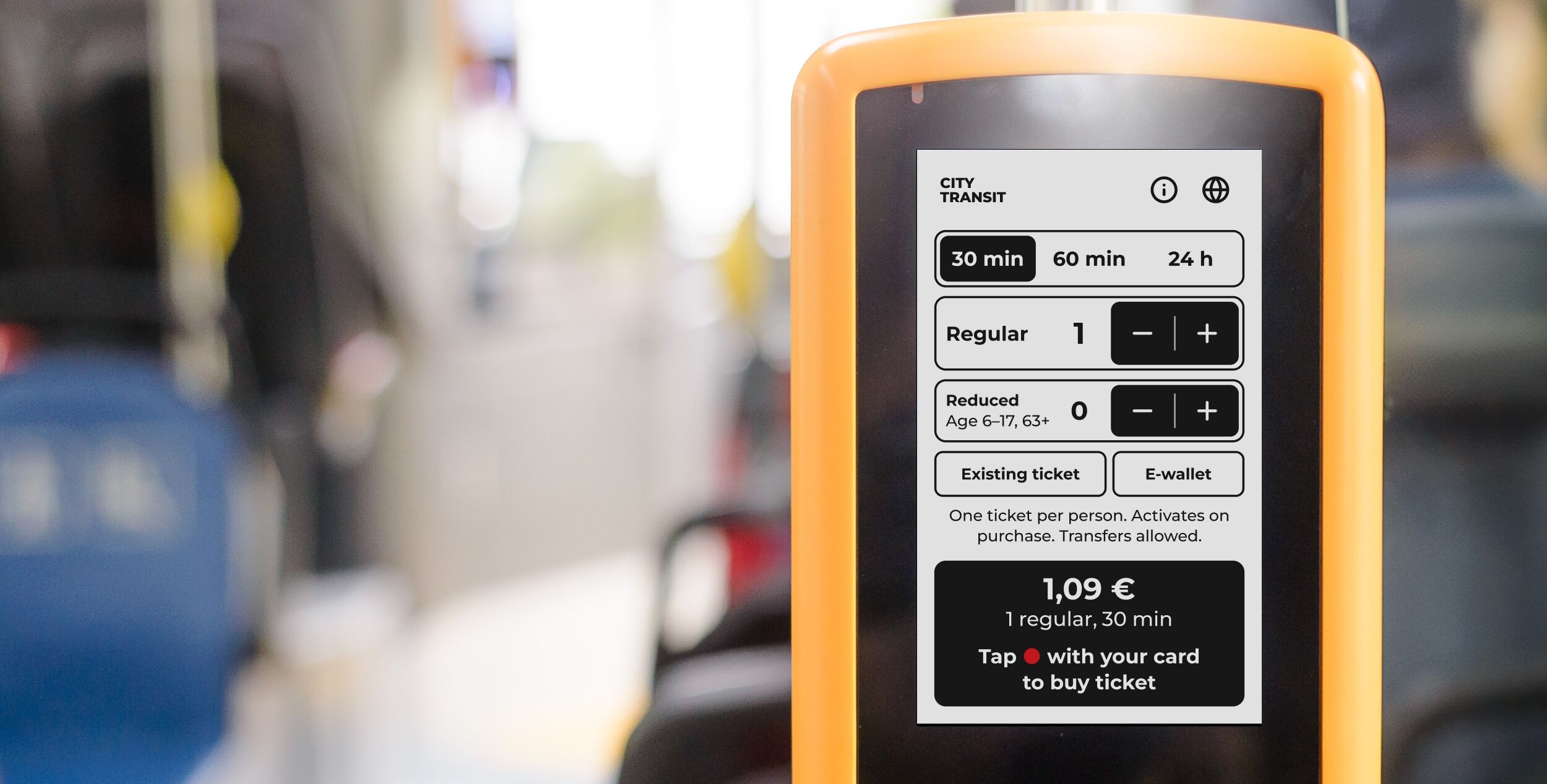
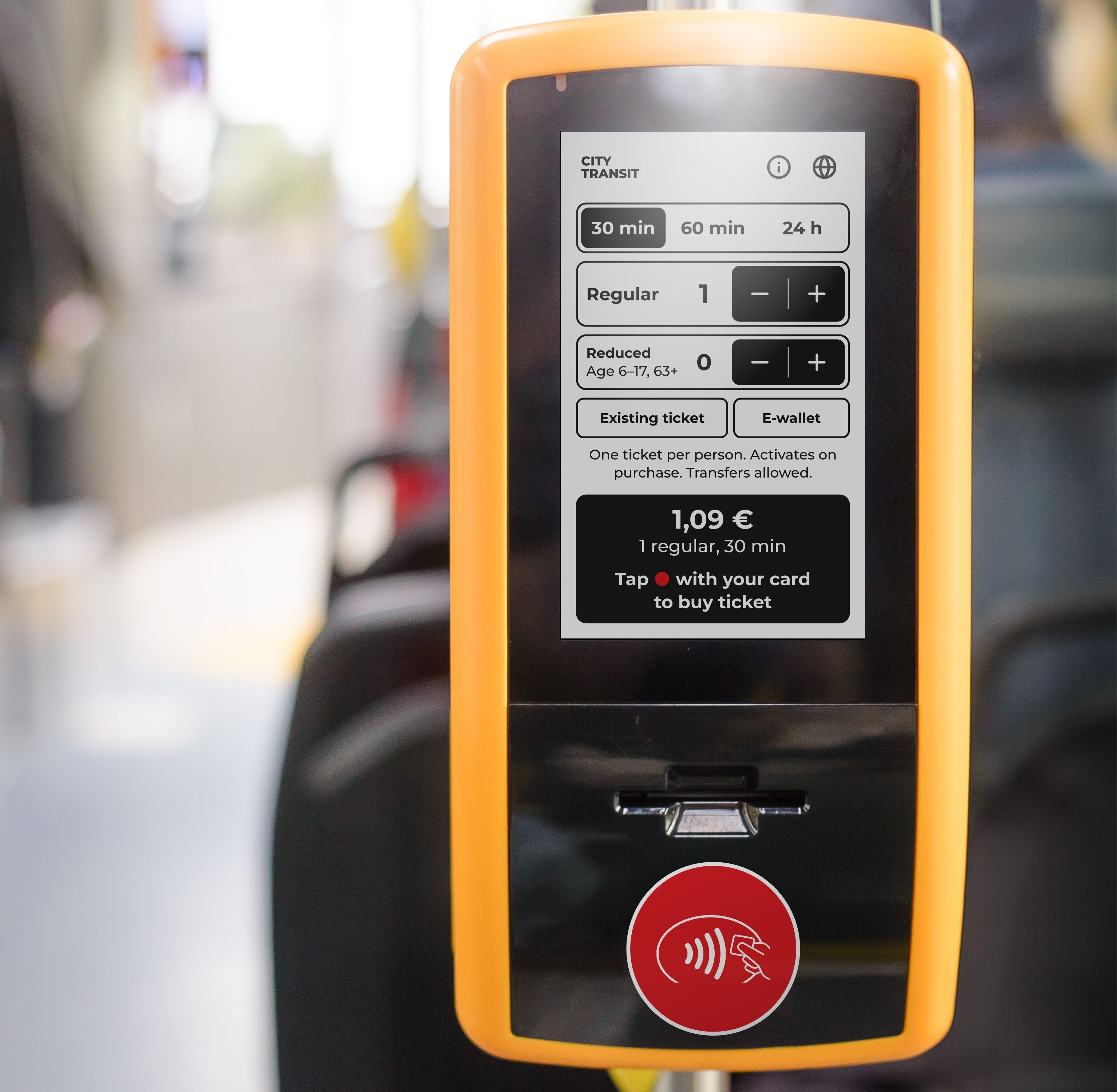
The solution was formed by two key problems: 480×800px low contrast 9cm wide touch screen, and the fact the typical users interacts with it completely untrained (tourists, occasional travelers) and also in a hurry, on a moving vehicle, with a queue of people behind them.
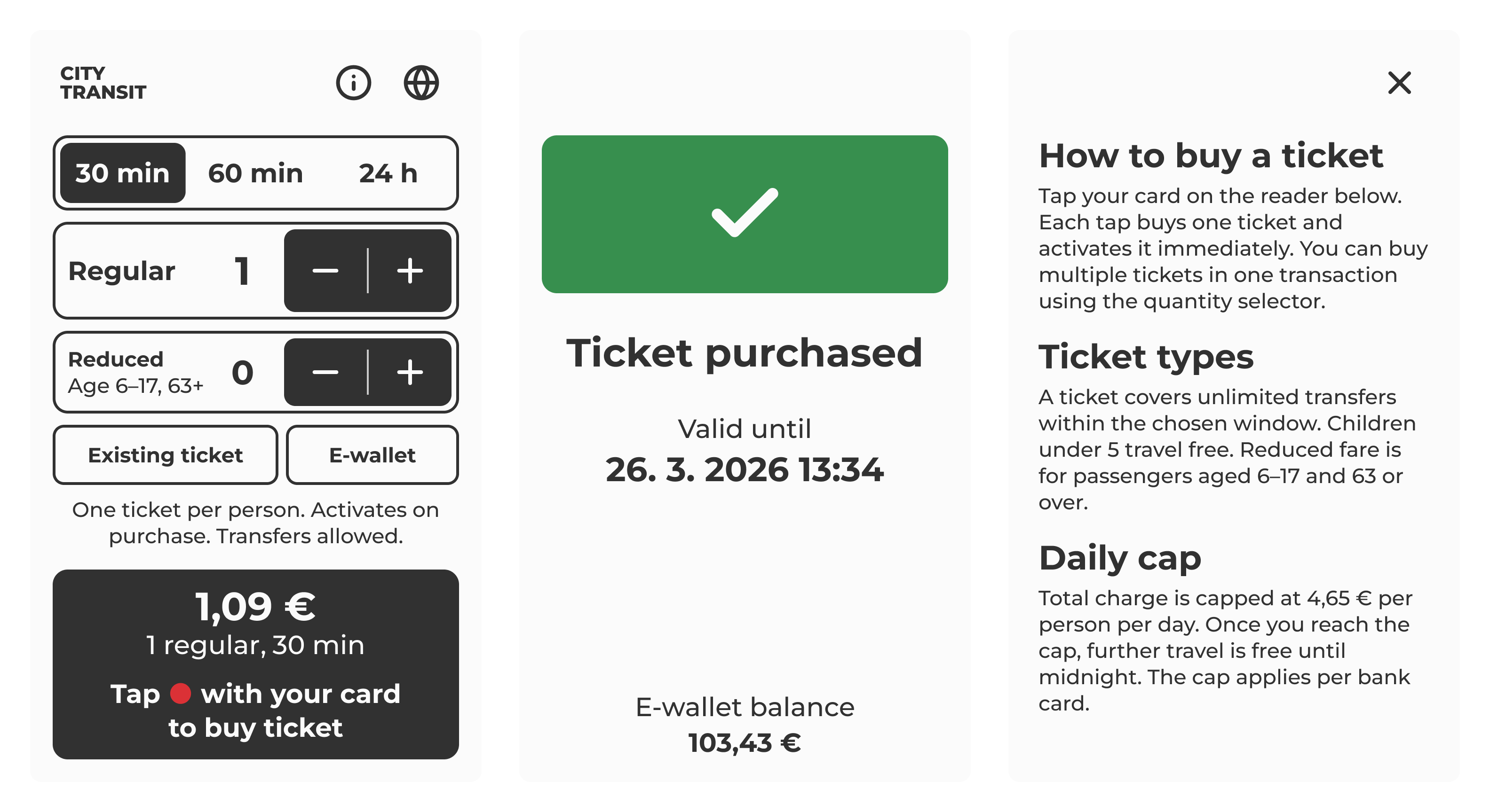
I chose to use very large type and very hard contrast while keeping the most information on the screen as possible. The key was also to keep all the data and functionality intact: single card tap to buy basic ticket, reduced and multiple tickets available without any further navigation, straightforward language change, and clear copy to affirm user when needed.
Fare structure
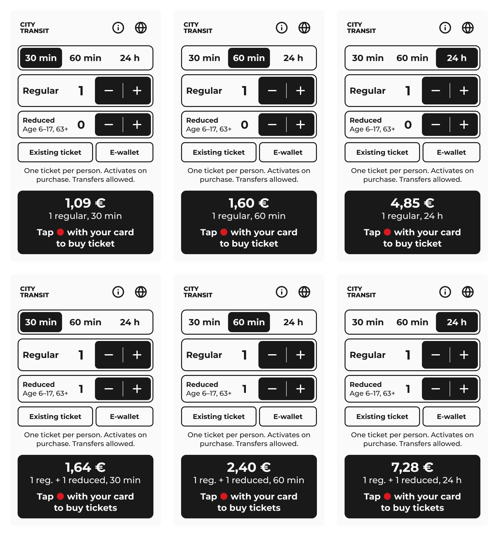
There are three ticket durations, two fare categories, an e-wallet with 14 options, mixed group purchases, ticket checking and extension; all in four languages. A lot to hold together in a small space.
The dual stepper
Segmented control for selecting either 30 min, 60 min or 24 hour duration and one stepper for both regular and reduced fare tickets. Available immediately, without navigating anywhere and with clear copy.
Buying tickets for a group with mixed fares required a separate flow in the original. Here it's the default state — regular and reduced quantities on one screen, both visible, reduced defaulting to zero so single purchases require no extra interaction.
E-wallet
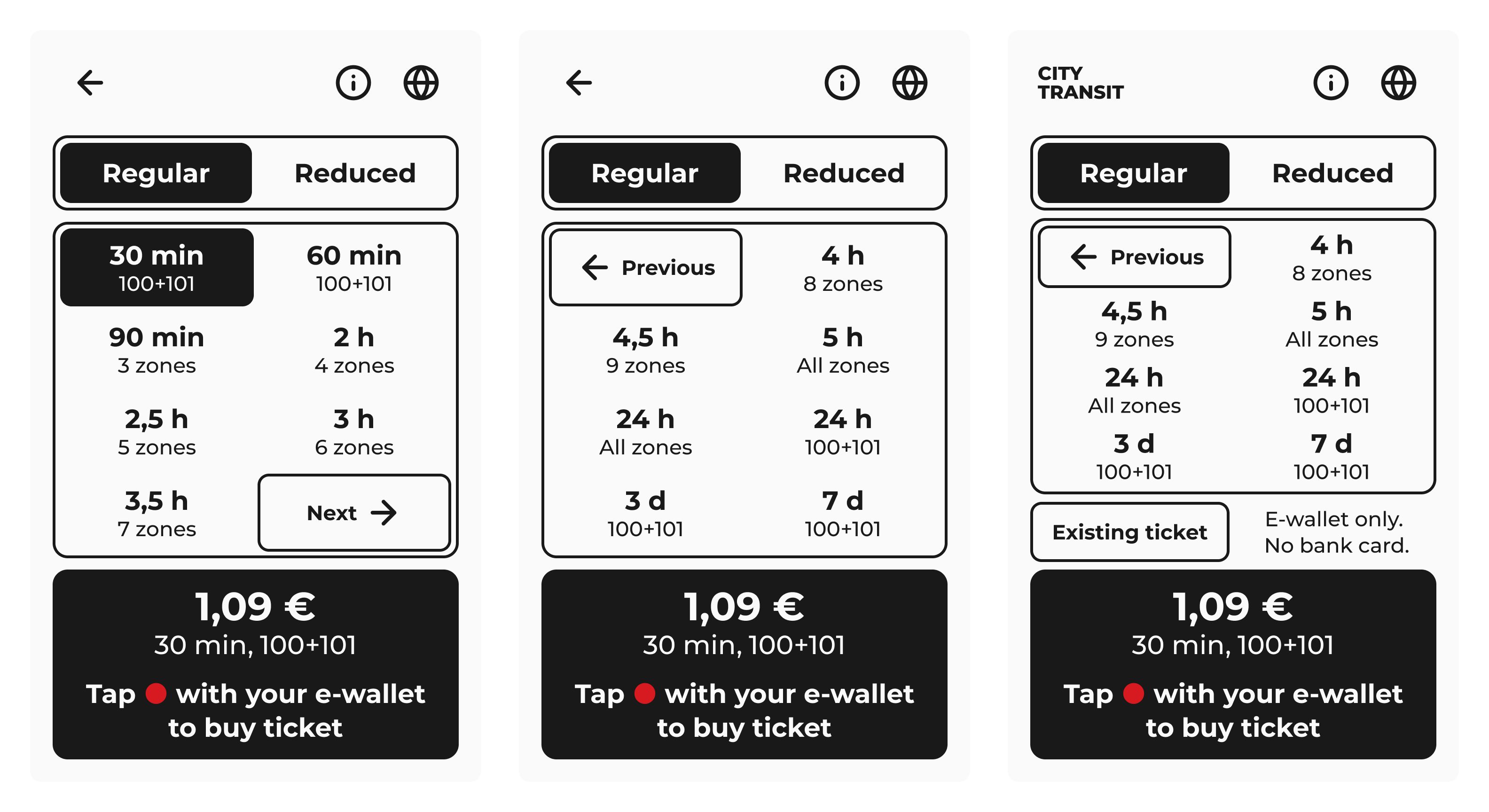
The e-wallet is a separate product with its own ticket catalogue — 14 options, zone-based pricing, spread across two pages. On some machines it is the only payment method available.
The same components carry the interaction — fare toggle, ticket grid, price bar and tap to confirm.
States and errors
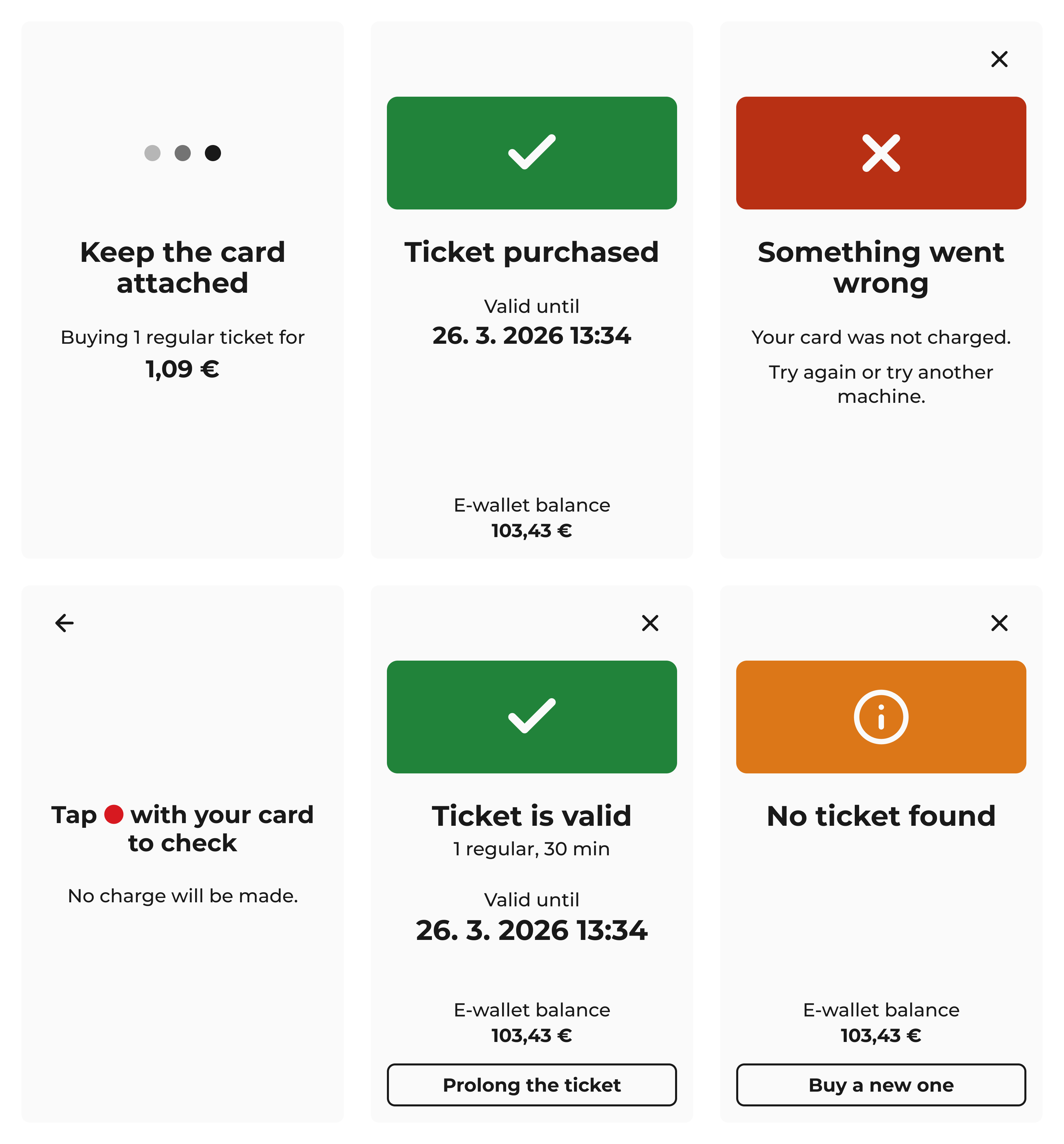
Every flow has a processing state, a success state, and a failure state. Copy is written to reduce anxiety — the system tells you what happened, what it cost, and what to do next.
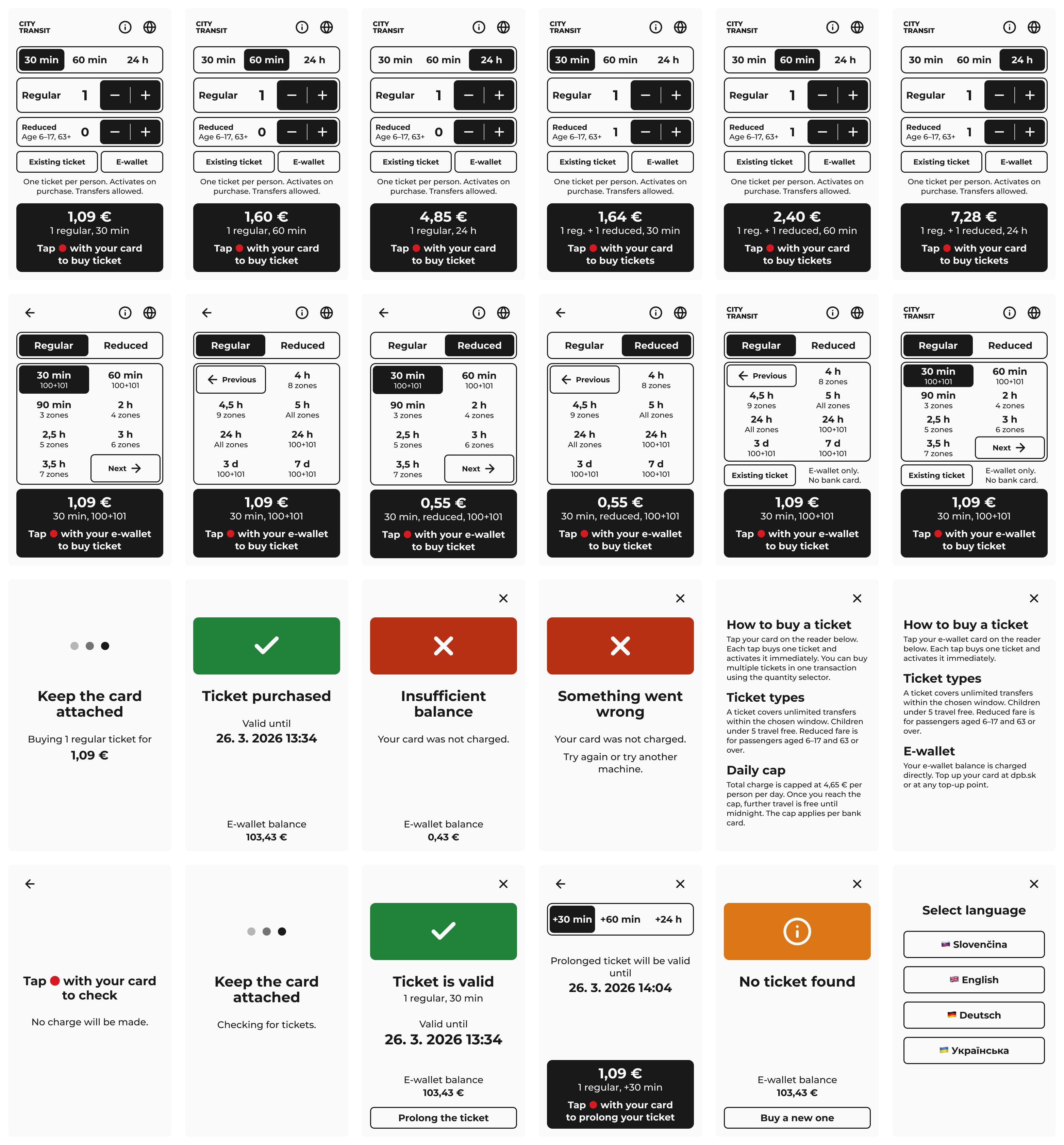
The full system
The result is a system that covers the same functionality as the original — nothing removed, nothing simplified away. It is all packed and presented in a way that doesn't require explanation.
Below is a before and after comparison and the full screen matrix.
Try it yourself in a public Figma prototype →