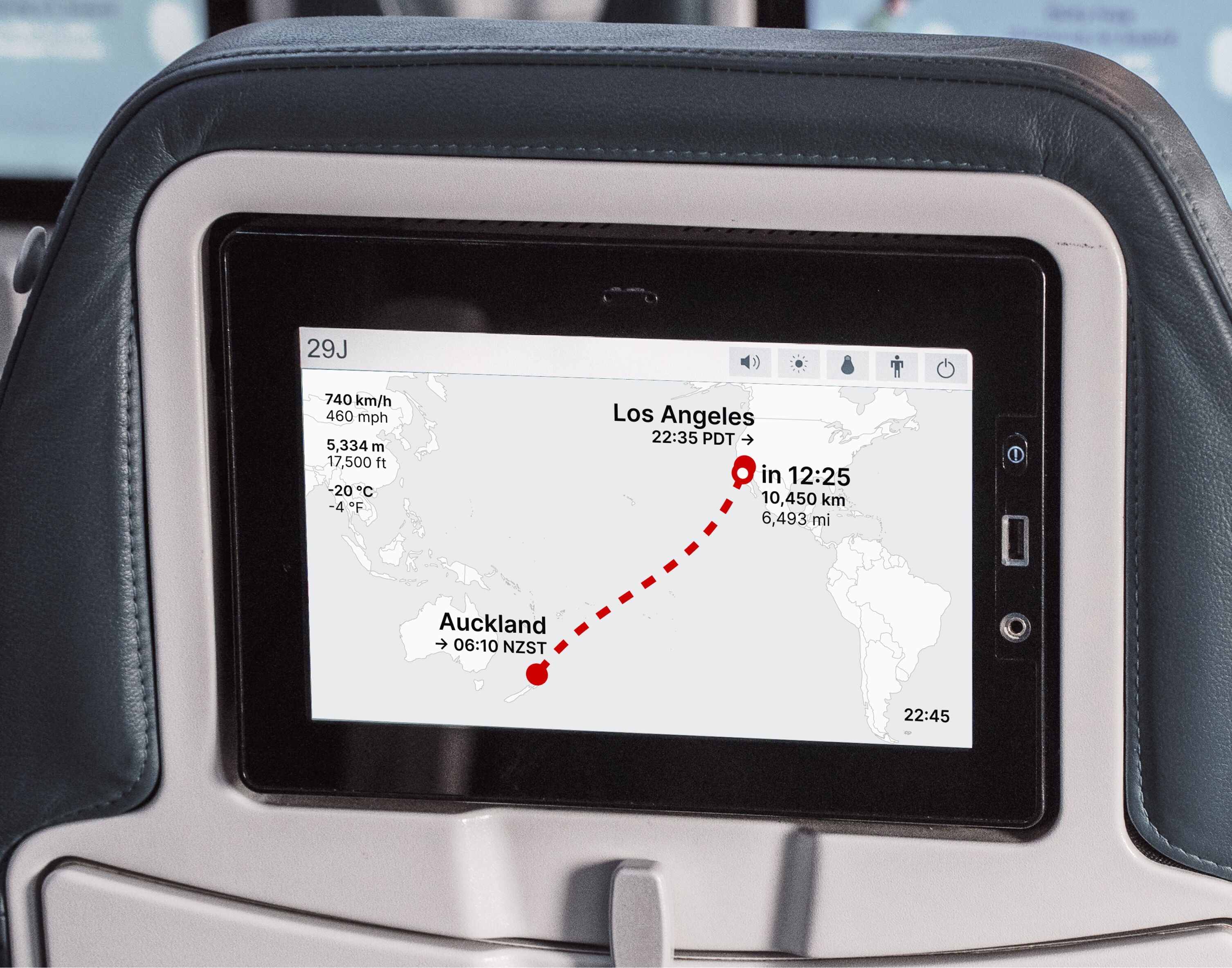
Flight progress display
A redesign for cabin overhead panels — one screen replacing ten
The problem and the constraint
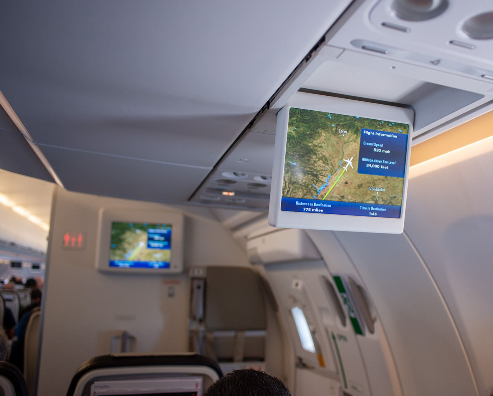
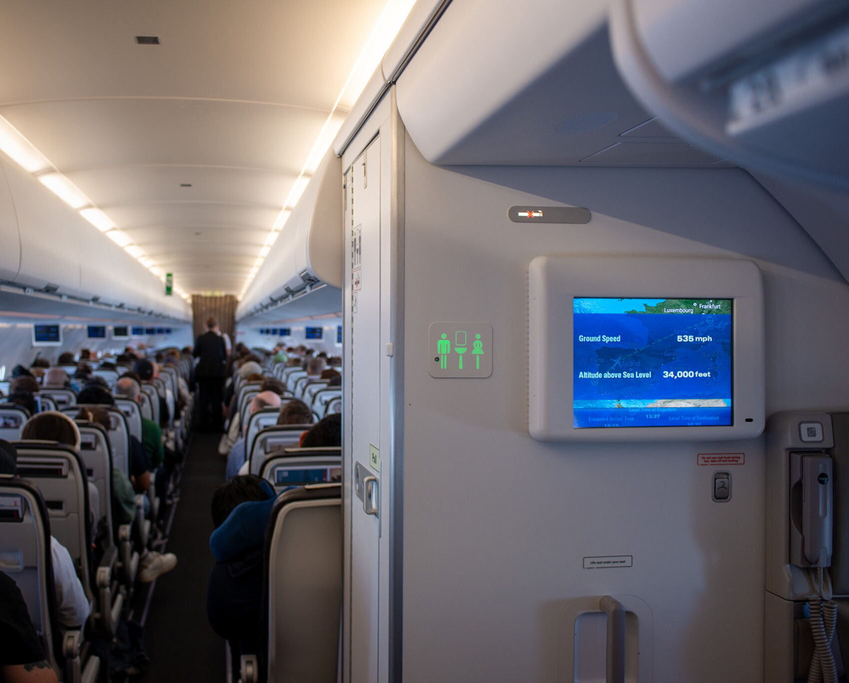
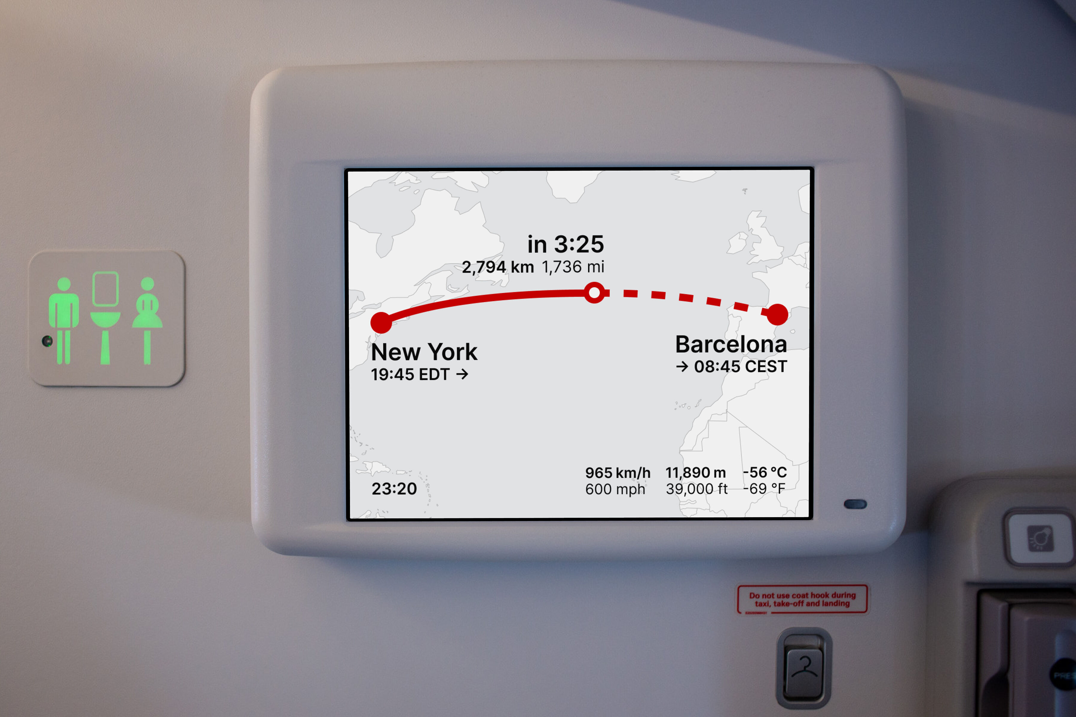
Existing flight progress displays rotate through approximately ten separate screens — map, speed, altitude, temperature, local times, distances. The passenger who glances up wanting to know how long until landing might see outside temperature. They wait. They get a map with no time on it. The information is present but never available on demand.
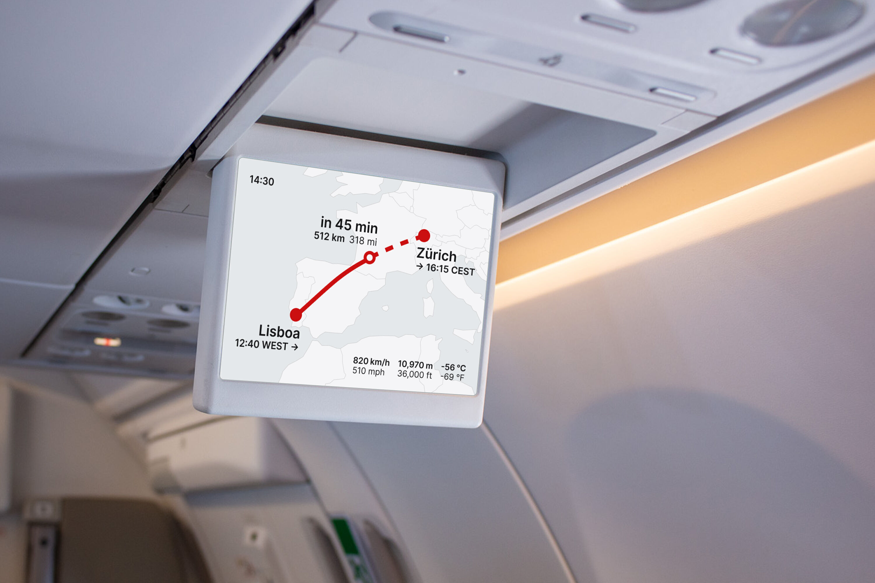
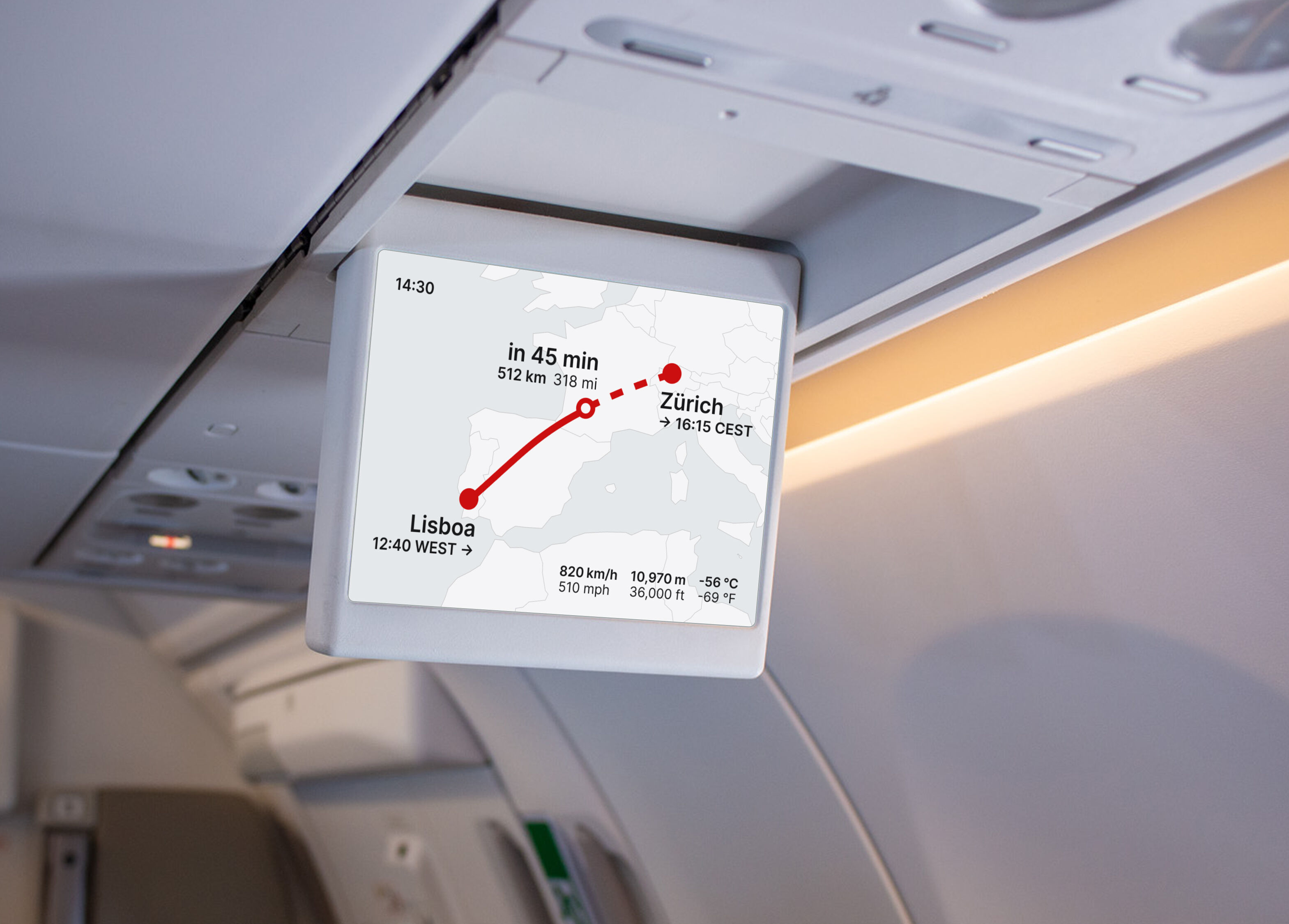
The smallest screen where this display is shown is the flip-down overhead panel — 19cm wide at 1024×768 pixels, viewed from approximately two meters. Everything in this project was designed for this hardest constraint and it scales up naturally to larger and closer screens.
The solution
Identifying what a passenger actually needs at a glance — and what they'll lean in to read — led to a one-screen solution. Everything the original ten screens carried, no rotation required.
Screen structure
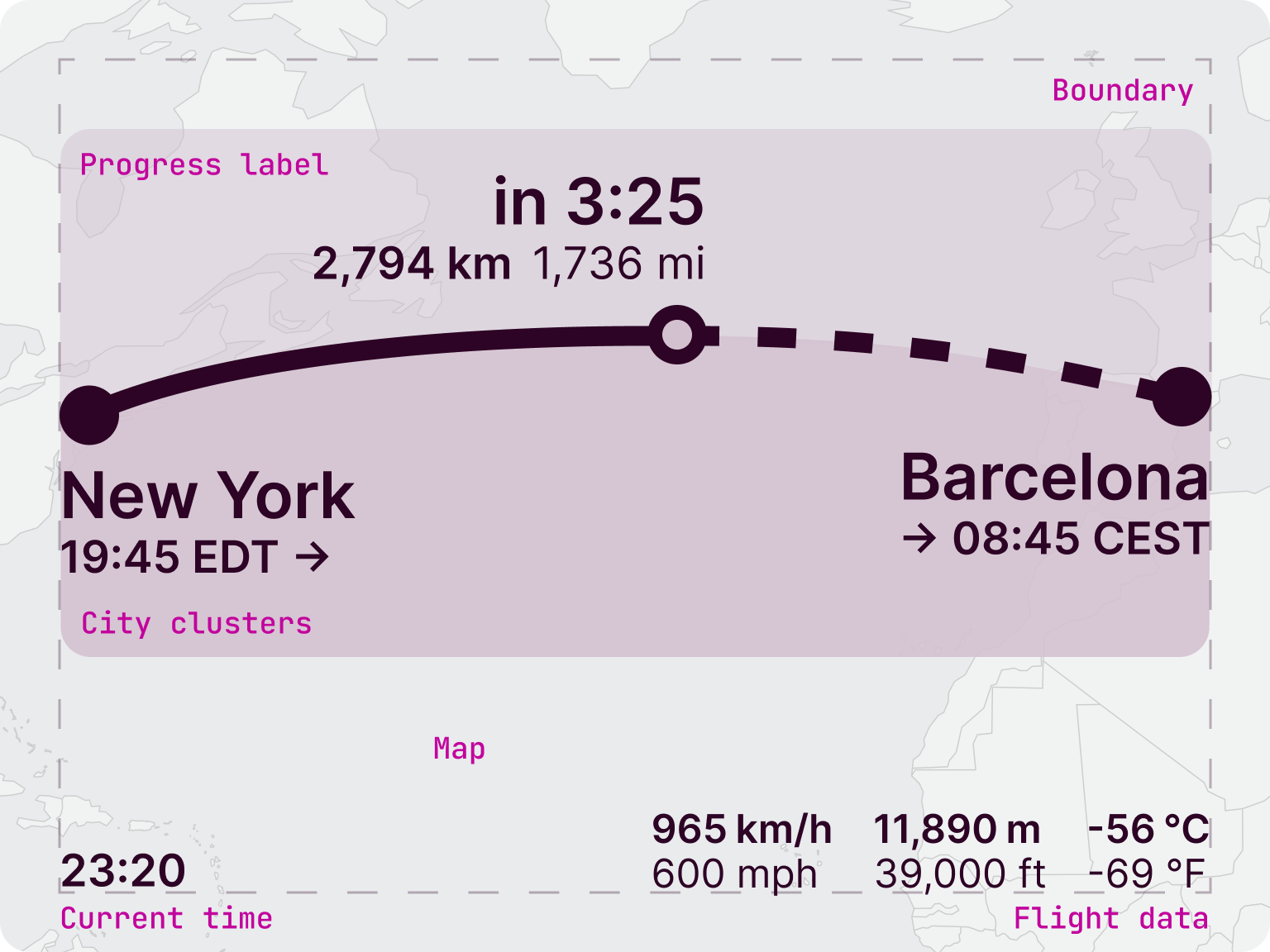
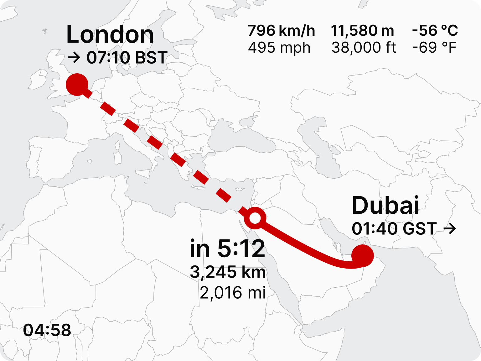
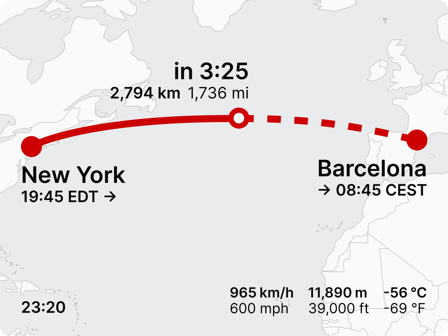
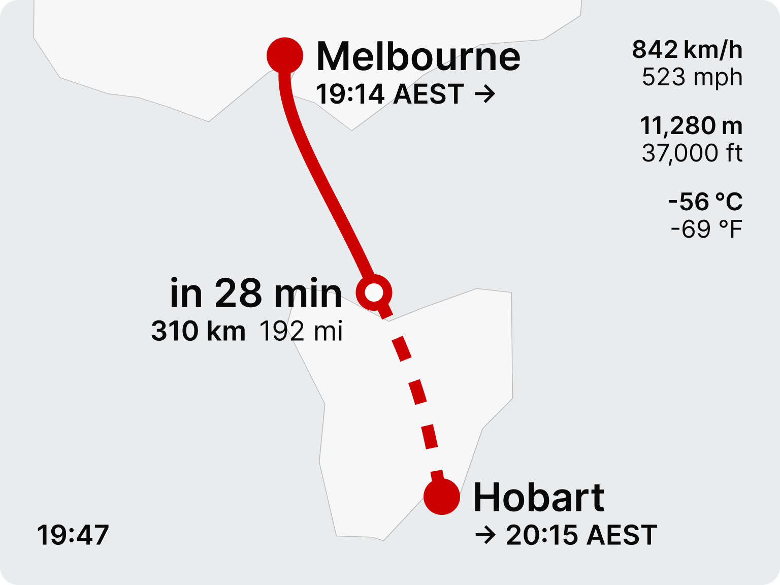
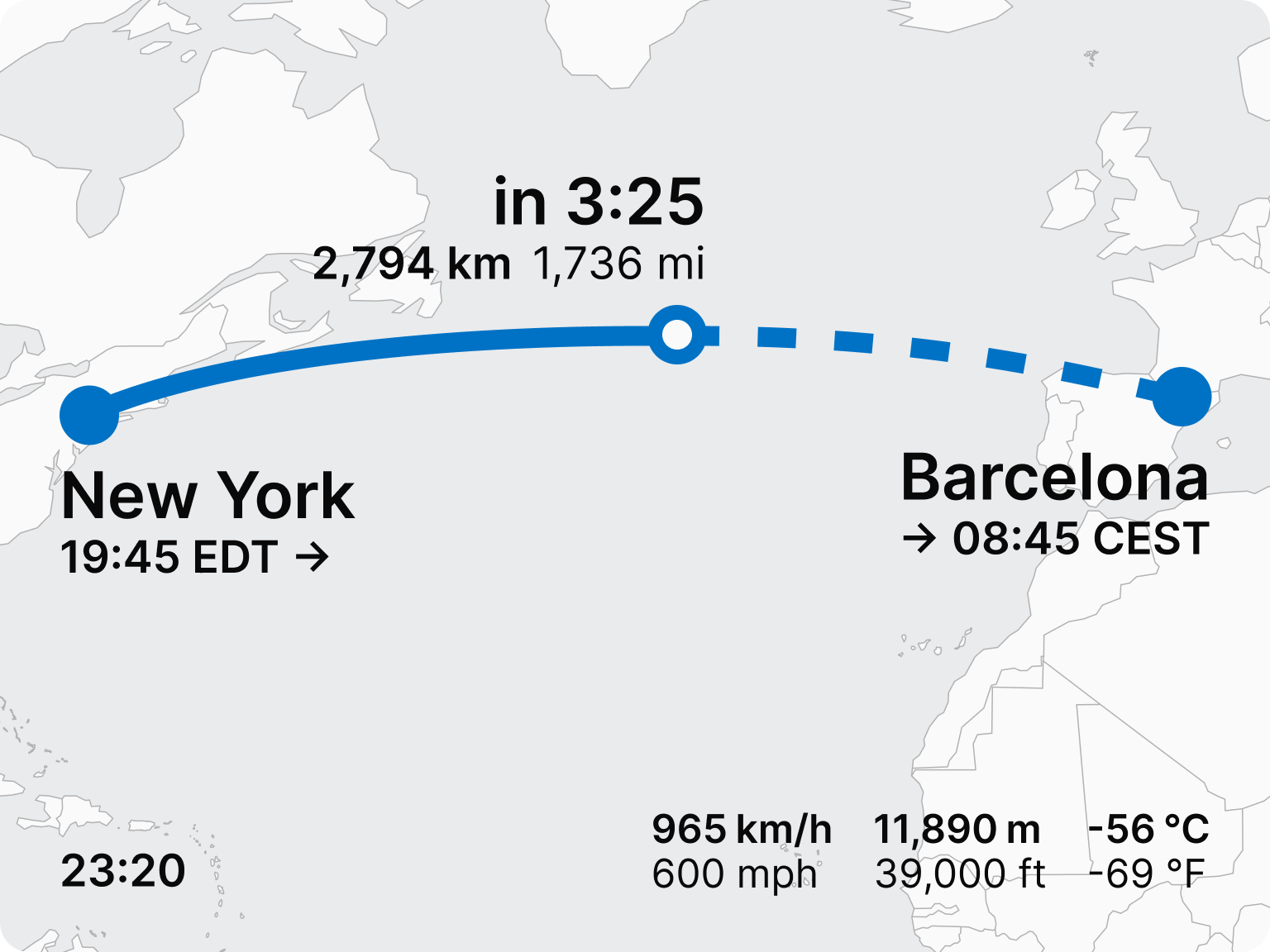
Components on screen are based on the path geometry. The departure and arrival dots anchor the city clusters. The open circle position marker moves along the path. The map crop is fixed to that same bounding box, north-up, never panning or zooming.
The result is a screen with one moving element and five stable ones, all spatially organised by the geometry of a flight path curve.
Design decisions
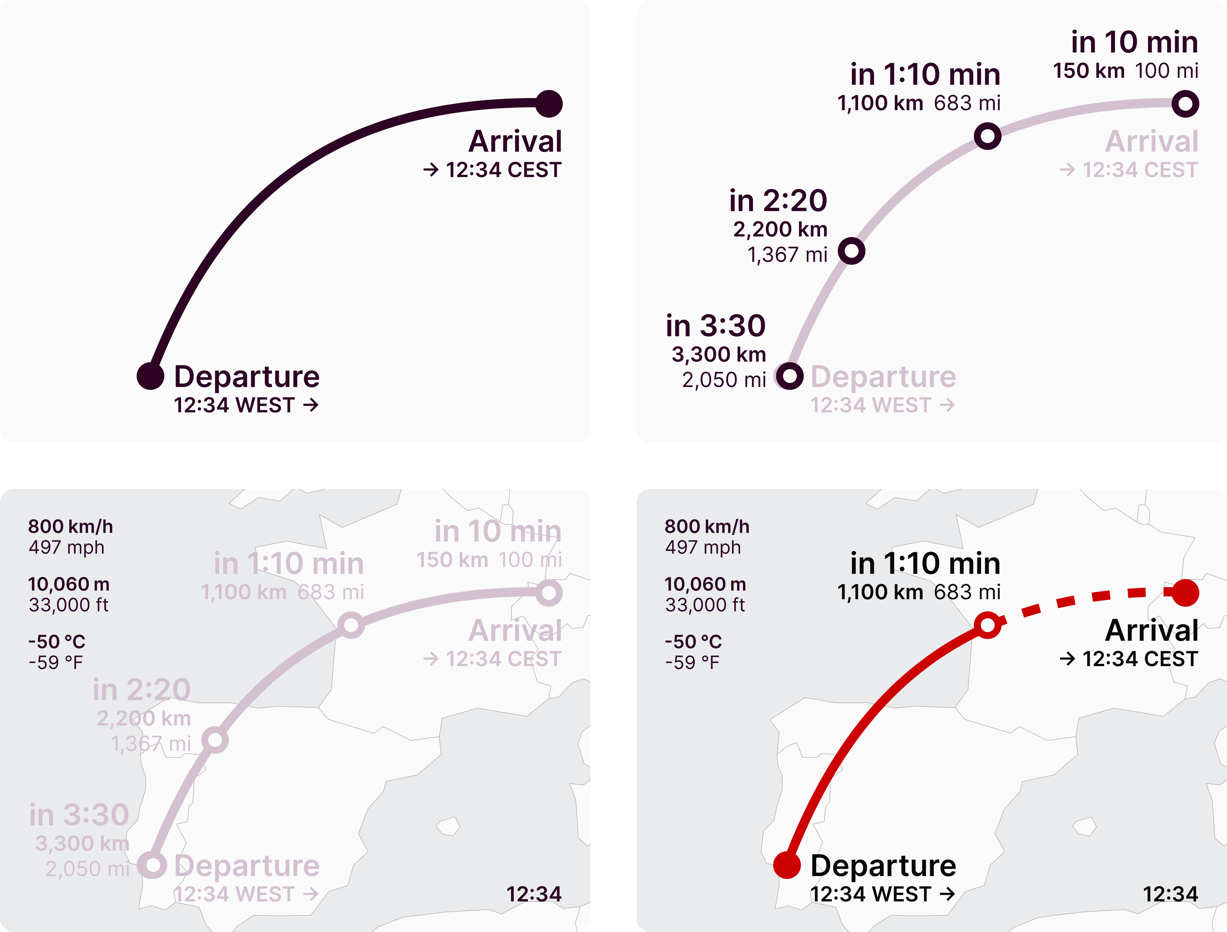
The flight path is initially rendered based on true flight plan, simplified to an extent so it forms a naturally looking curve. It is updated based or the real flight progress. Solid for the flown segment, dashed for the remaining, with an open circle position marker moving along the path. This is the base of the whole geometric solution.
The flight path acts as a progress chart axis: city clusters, departure and destination are always put inside the arc, moving progress label is always outside. They never clash.
Type scale is calibrated to the hardware and viewing distance: 52px for titles, 36px for secondary and 32px for tertiary.
Dual units are always visible — metric primary, imperial secondary.
Secondary data are put in the furthest corners to not interfere with anything else. The clock is set to the departure timezone. It matches the passenger's body, watch, and the departure time shown in the origin cluster.
And bonus: the map is kept very Spartan. It provides spatial orientation, but has no labels but borders, with white continents and gray water. The passenger can recap their geopolitical skills as a bonus.
The system in real world scenarios
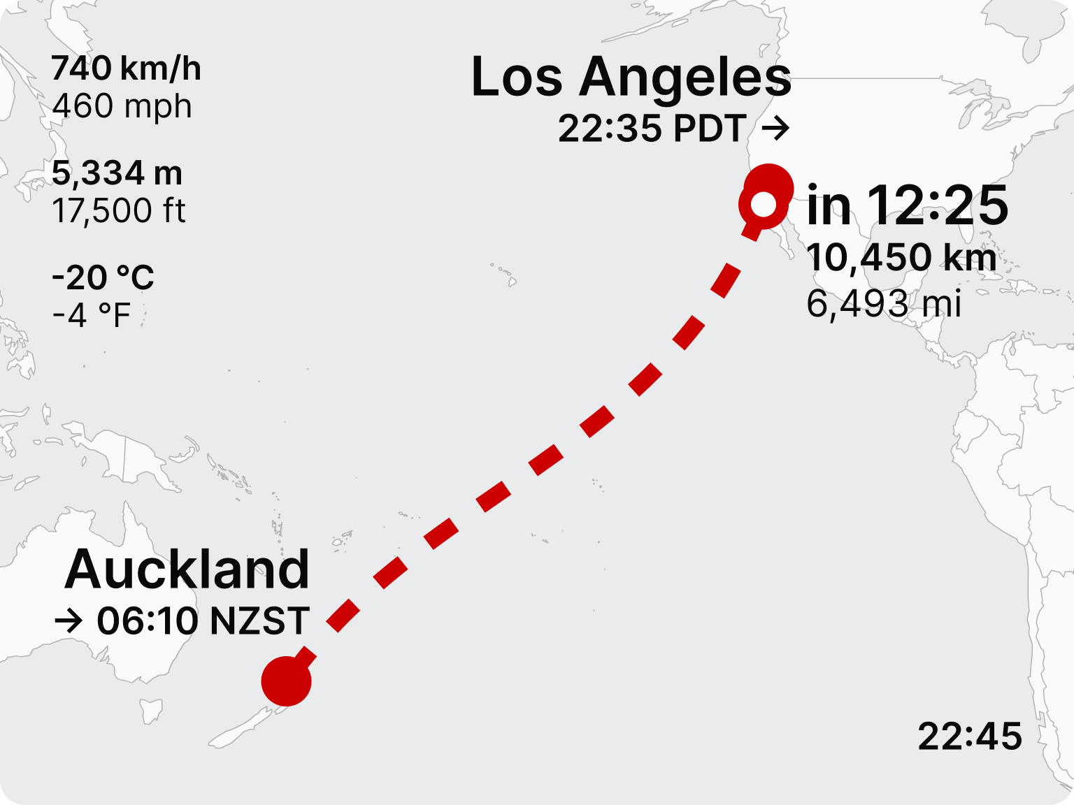
Four routes chosen to stress-test the layout against genuinely different geometries — a Pacific route where the map is mostly ocean, a Middle East diagonal shaped by real airspace constraints, a wide transatlantic route, and a near-straight domestic crossing.
Before and after
Comparison rendered on actual cabin hardware.
White label and dark mode
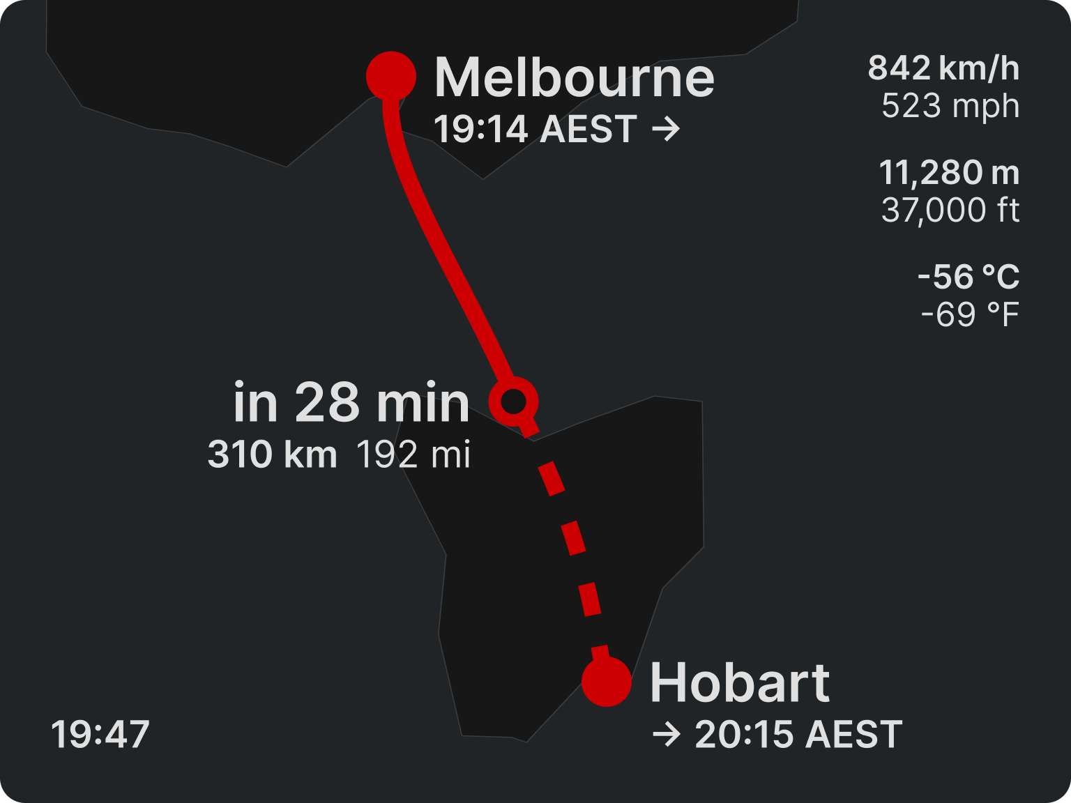
The visual identity layer is a single colour token applied to the arc and the dots. Everything else is neutral — the system fits any airline's brand through one variable.
Neutral colours allow for a straightforward dark mode, for when cabin lights are dimmed.
Integration
The screen is also designed to fit into an existing in-flight entertainment system as a standalone module — the same way flight progress already exists as a discrete feature in systems like Panasonic Avionics or Thales. The layout rules, bounding boxes, and label placement logic are specified as a design system, ready for any screen size and ratio.