Modern glass cockpit
Glass cockpit for experimental aircraft.
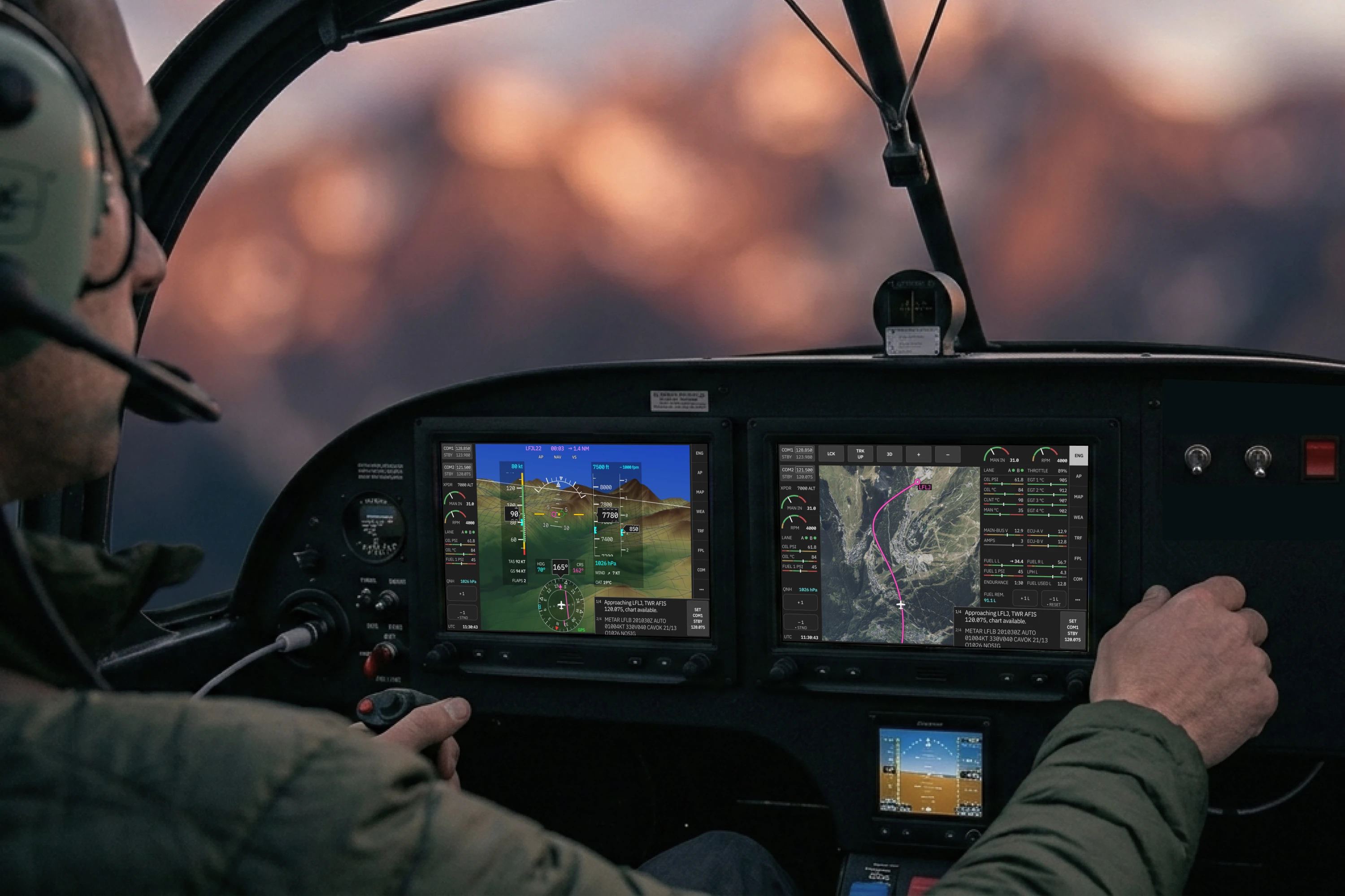
Glass cockpits exist in a UI league of their own. Stress, vibration and high workload leave no margin for error — everything pilots do relies on muscle memory and instant readability.
Garmin set the standard. Their cockpits are certified, trusted and proven worldwide.
But experimental and ultralight aircraft play by different rules. No certification ceiling brings more room for aggressive innovation — and no excuse for an outdated UI.
Grid & visual language
The glass cockpit takes its visual language from Swiss International Style — the graphic design tradition behind some of the most legible communication systems ever made — designed to be read instantly, under pressure or in turbulence.
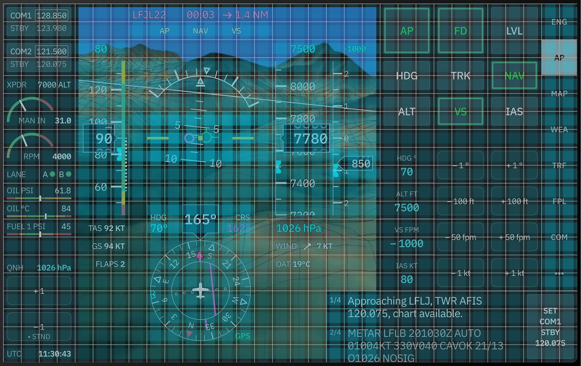
The system is built on a strict grid. Every element earns its position strictly through function. There is zero margin for ambiguity. Color appears only when it carries meaning. The result is a display that reads like print.
Typography and element sizes
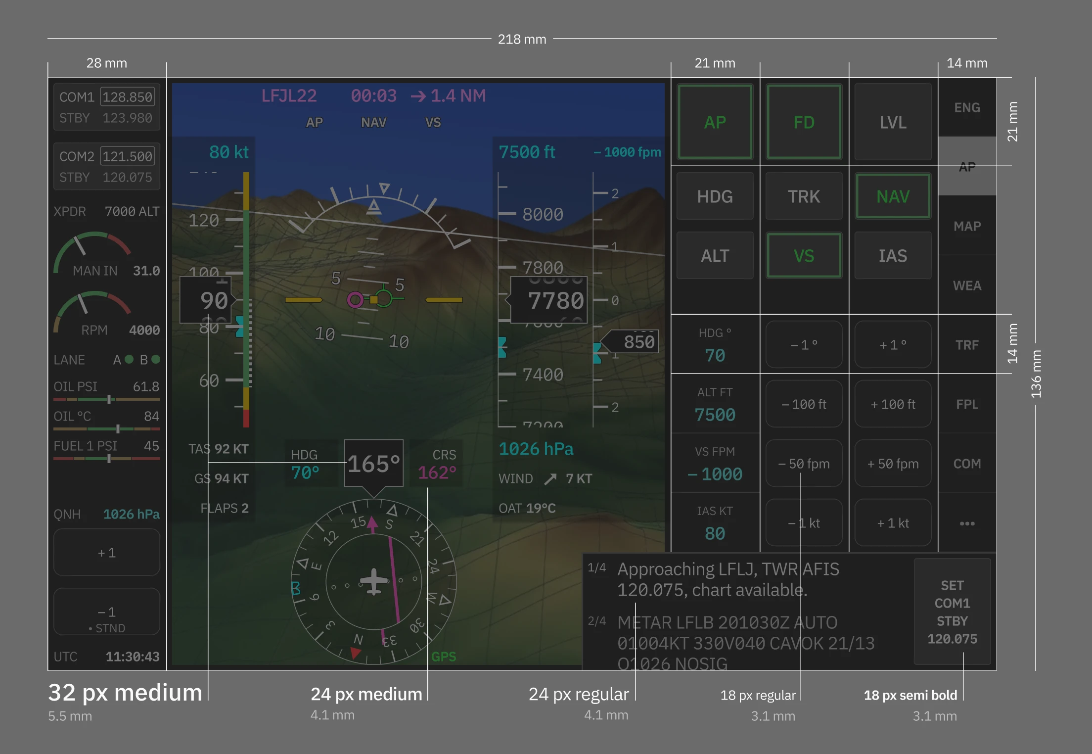
Typography is optimized for 10" screen. With three sizes providing enough legibility for each component, with critical data being the largest.
The cockpit can be operated entirely by touch. Every interactive element is built to a minimum 14 × 14 mm touch target. Critical controls like navigation, autopilot modes or QNH adjustment are sized even larger.
Touch operation
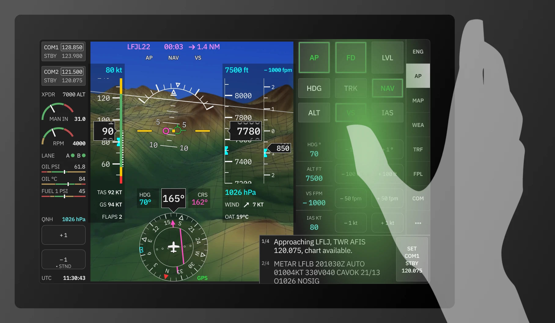
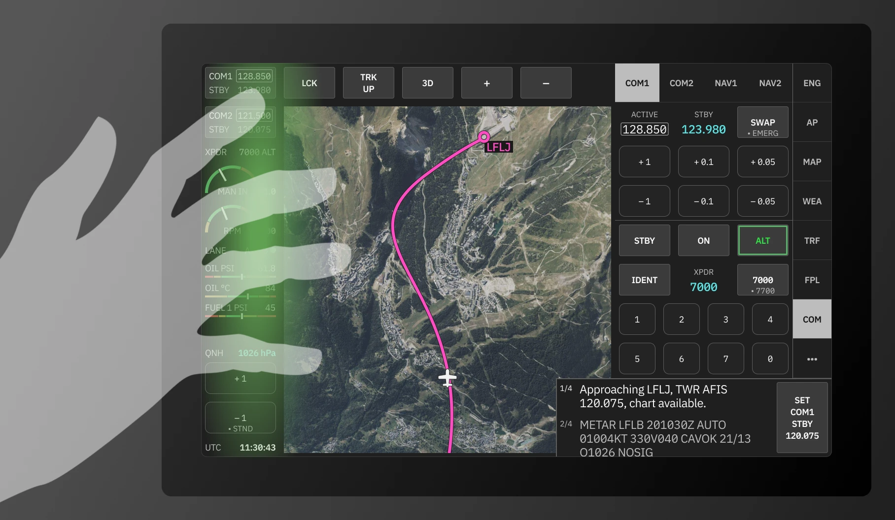
Panel placement follows hand position. Neither hand needs to cross the screen during operation — both can rest naturally on the bezel, reaching only as far as needed, without obscuring set values or flight data.
Composition
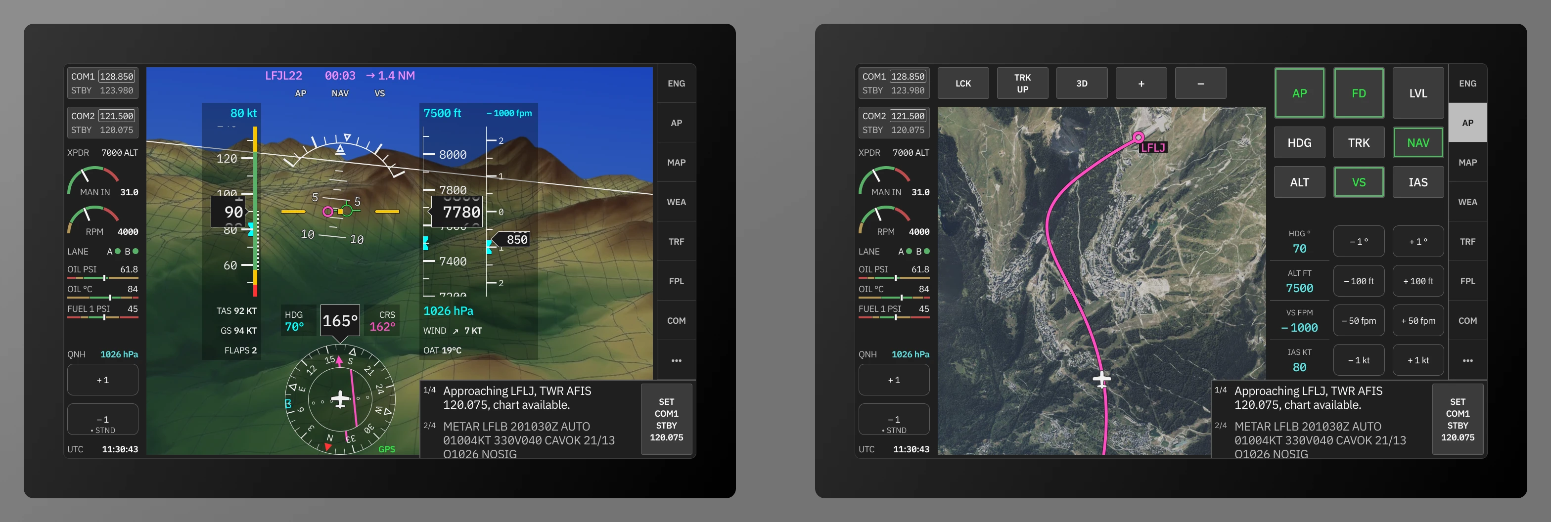
The cockpit is optimized for both single-display operation and for the traditional PFD+MFD dual setup.
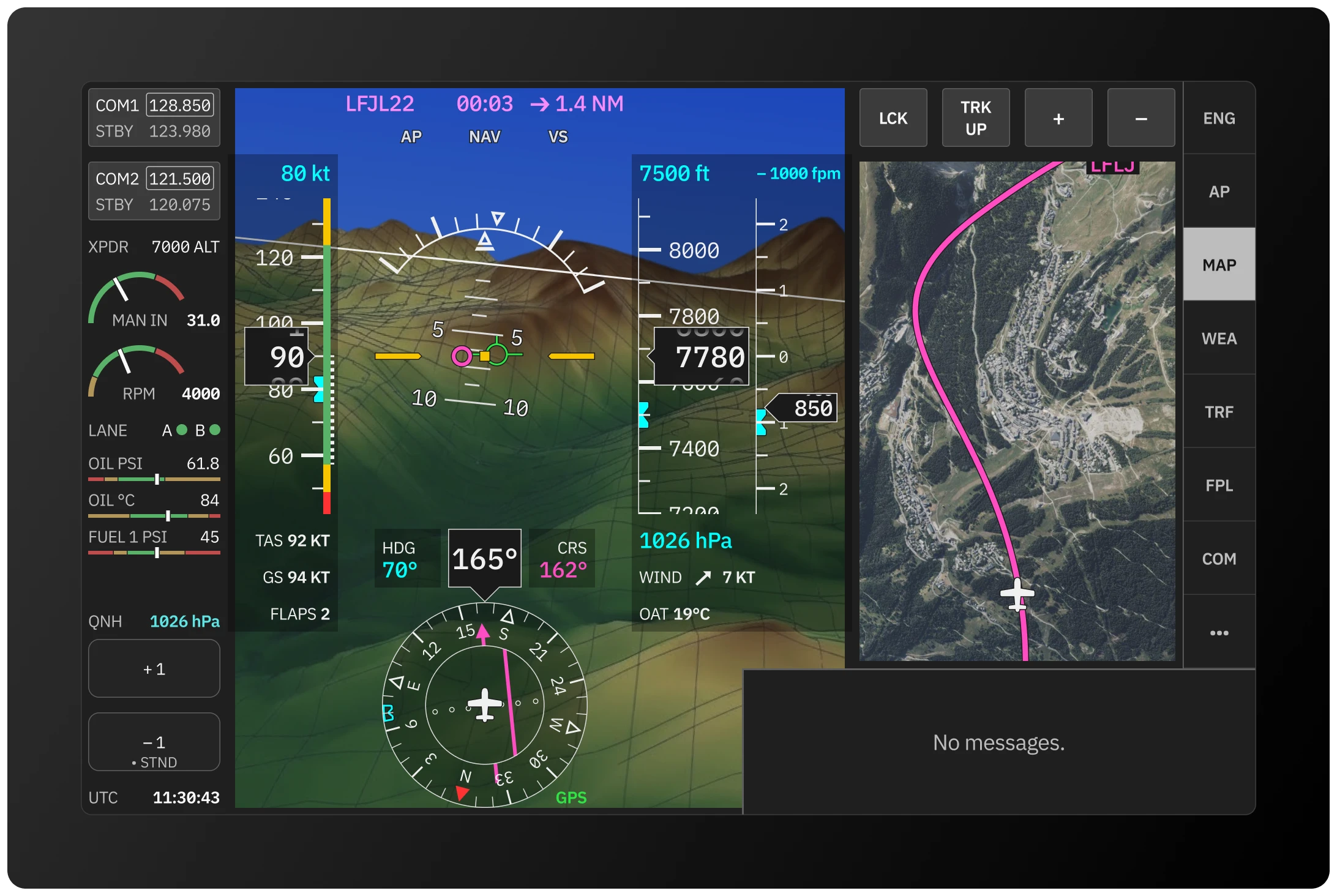
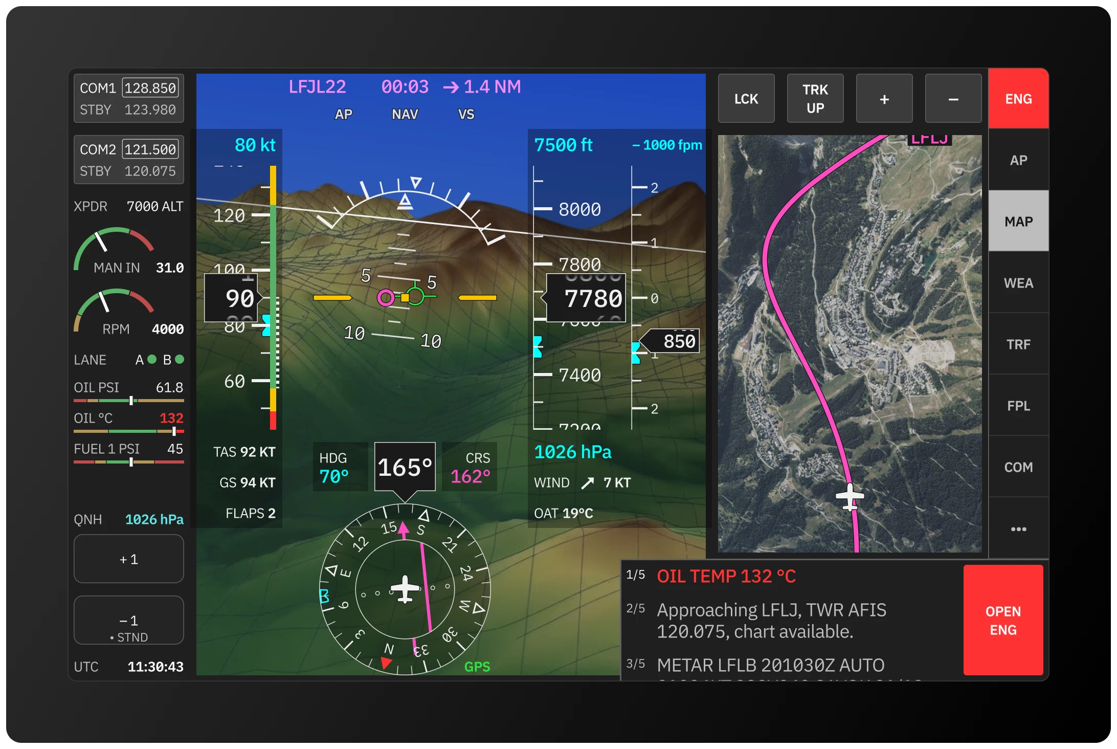
The screen is divided into four persistent zones: the left panel, the centre section, the right side and the combined notifications and actions strip (ECAM).
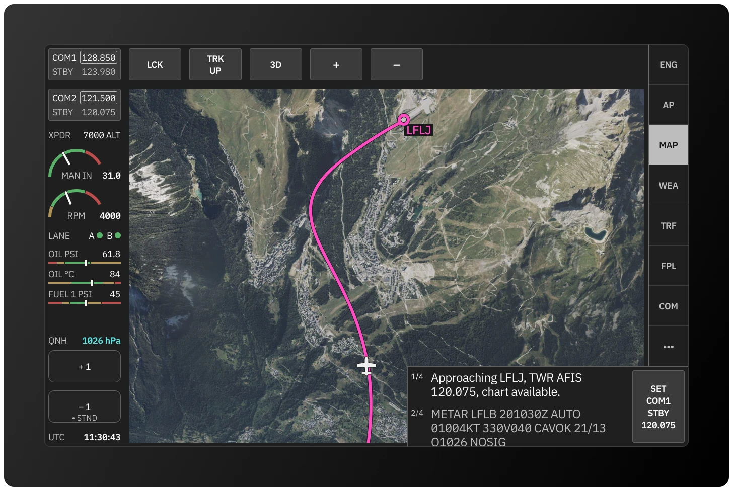
The left panel displays radio settings, essential engine data, QNH and UTC. The centre shows primary flight data or the moving map depending on context. The right side is for interactive modules: engine detail, autopilot, communications, map controls and more. The ECAM shows live flight related data, actions and — most importantly — warnings and errors.
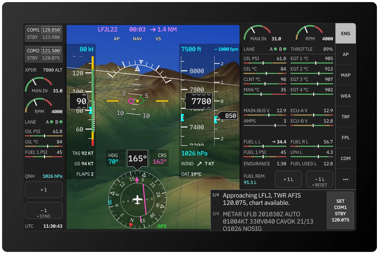
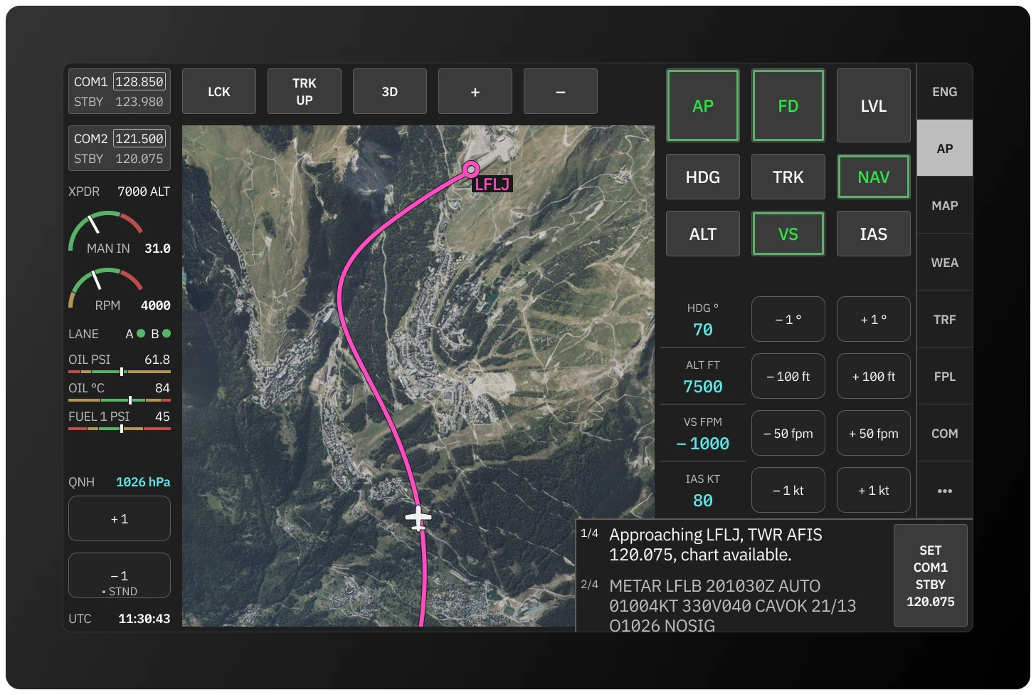
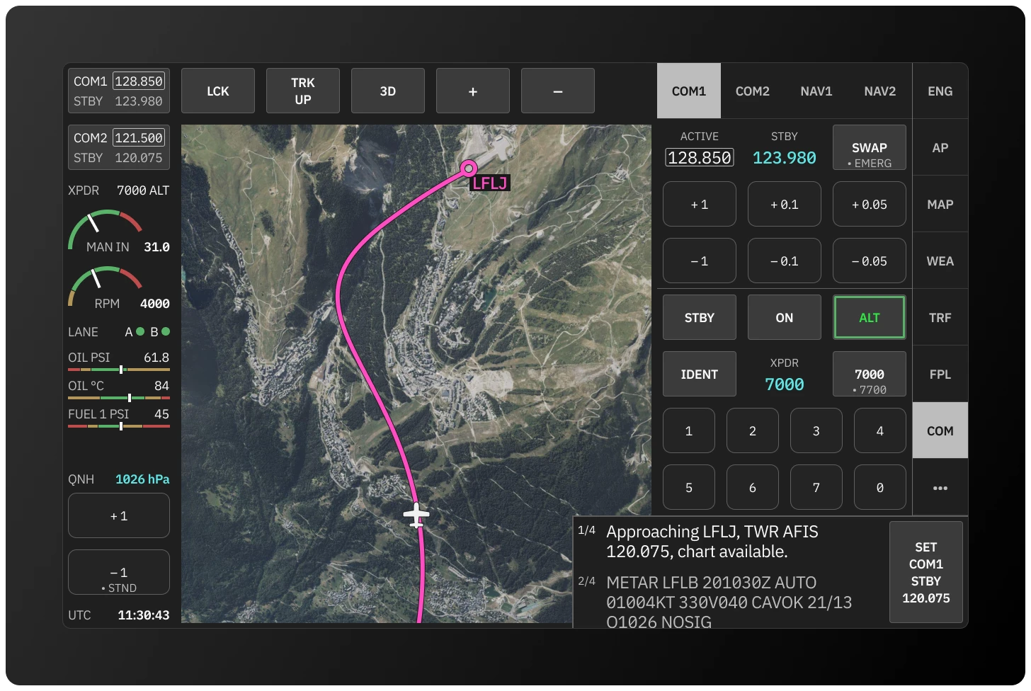
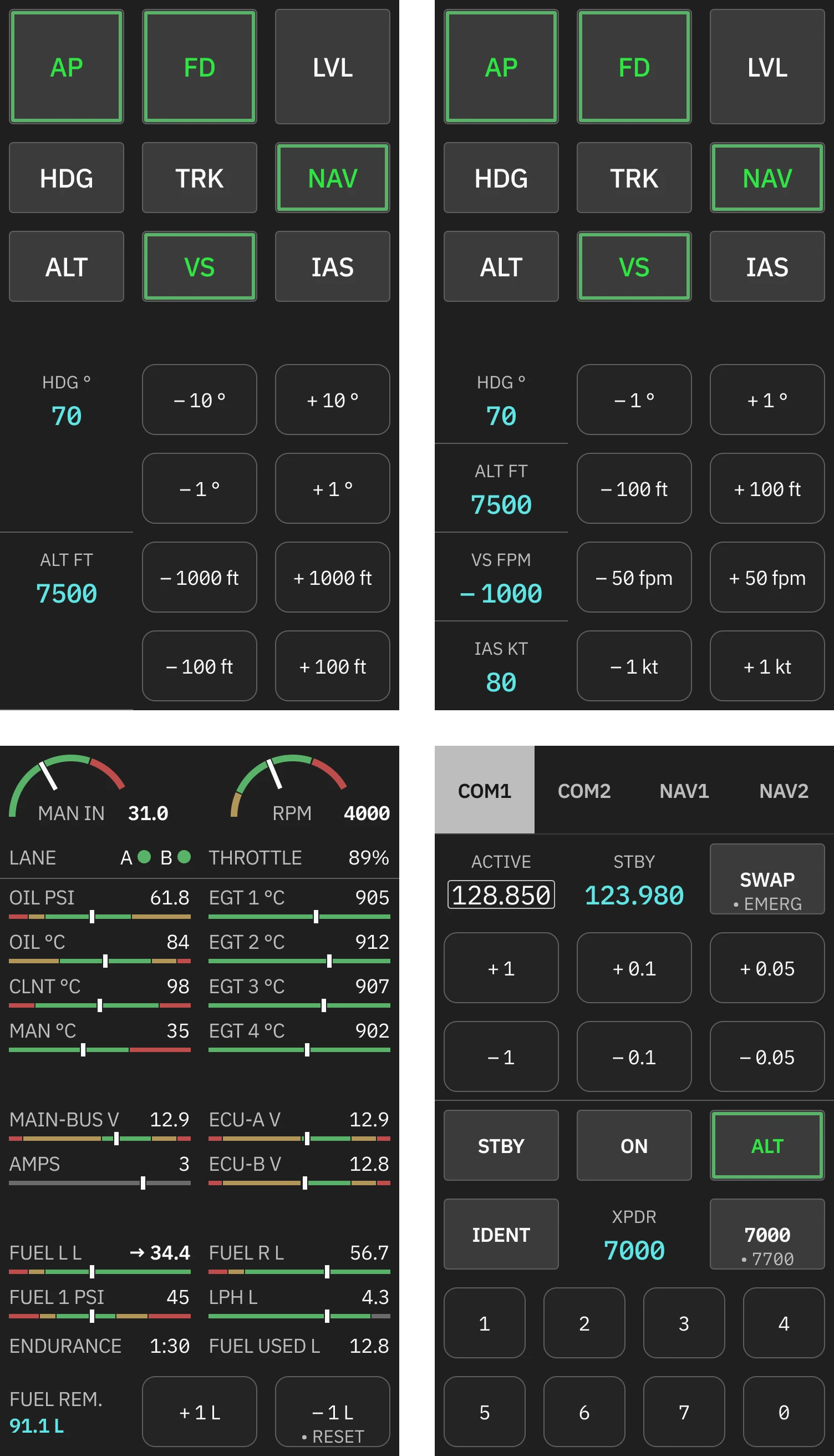
AP, ENG and COM panels
The autopilot panel separates mode toggles from value inputs. Each mode is set independently — HDG and ALT for classic operation, or all four with IAS and VS for full autopilot control.
The engine panel displays all critical parameters in a structured grid — dials for the two primary power indicators, sliders for monitored values. Color follows a strict three-state logic: green for normal, yellow for caution, red for critical.
The communications panel combines radio and transponder management in one place.
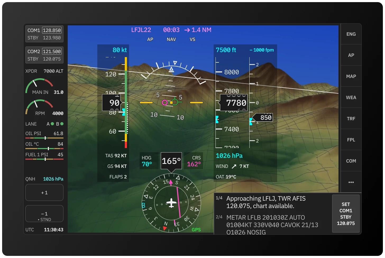
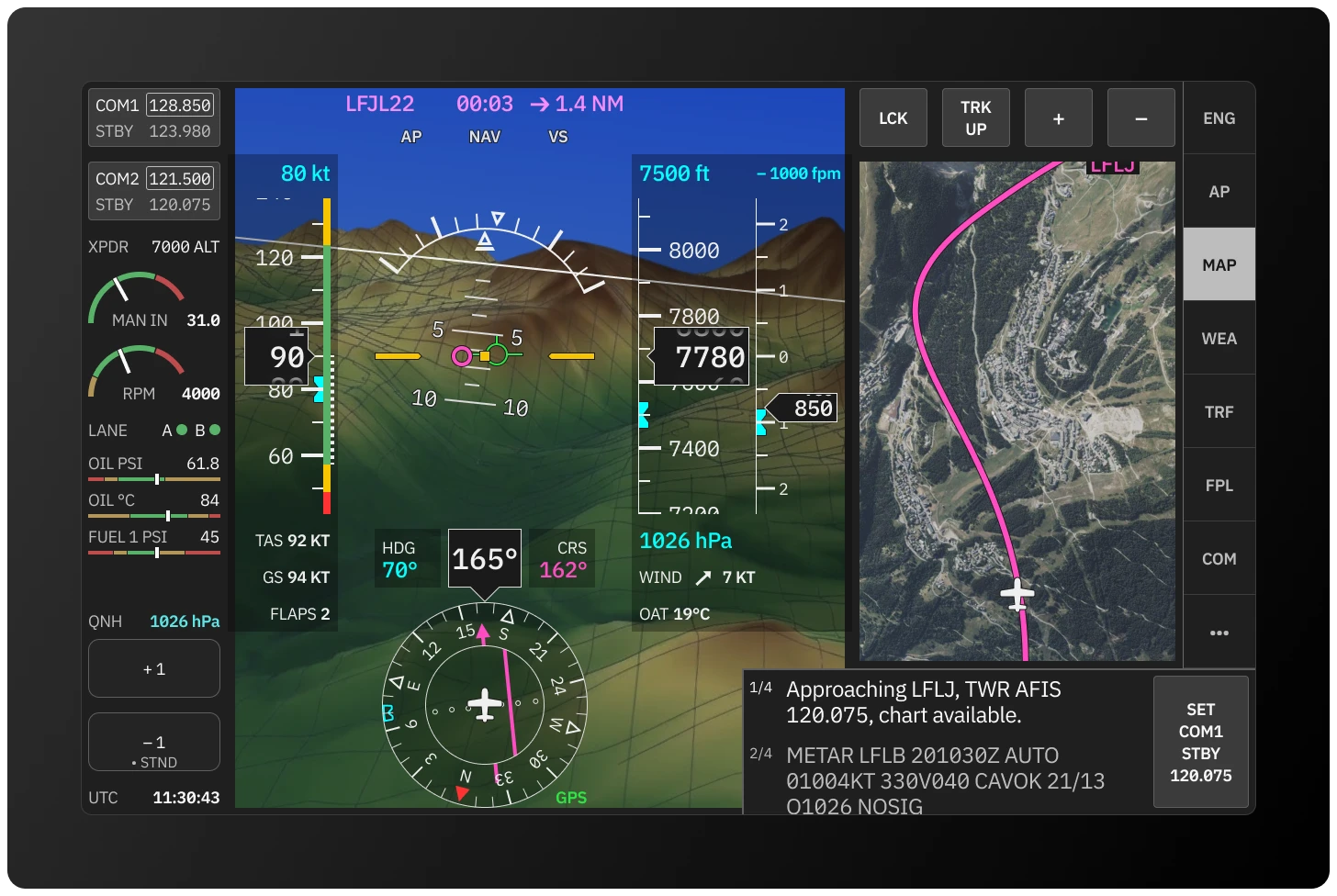
Primary flight display
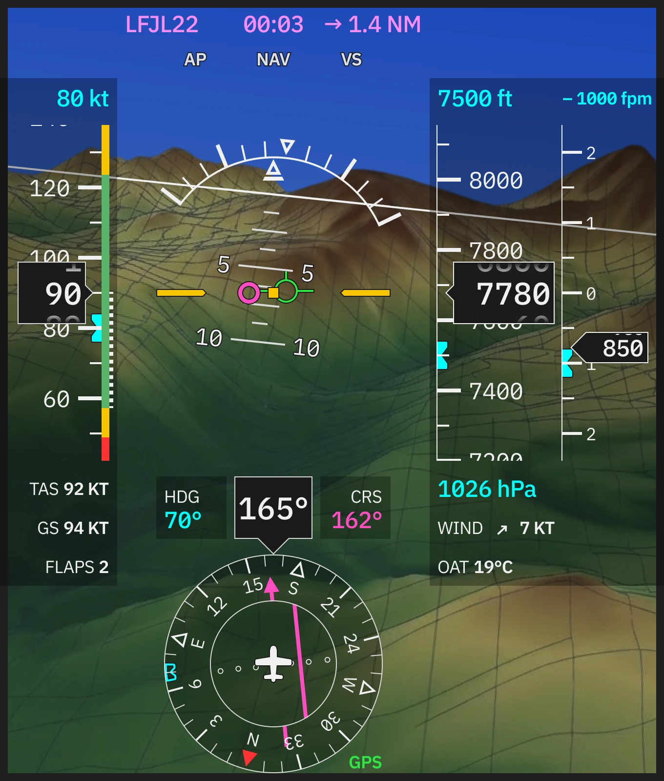
The PFD follows the scan pattern pilots already know. Attitude centre, speed left, altitude right, heading below — the same spatial logic as every other glass cockpit. The cockpit doesn't ask pilots to relearn where to look.
What changes is the visual weight. Synthetic vision provides terrain context without competing with the instruments overlaid on it. The flat layer sits clearly above the world providing pilot with information layers, each readable on its own terms.
Speed and altitude tapes reduce color to its minimum useful role. A green arc, a yellow band, a red limit. The rest is typography — high-contrast values, consistent sizing, no ornamentation. The pilot reads position on the tape spatially and the precise value typographically, the same way they always have.
Notifications and actions
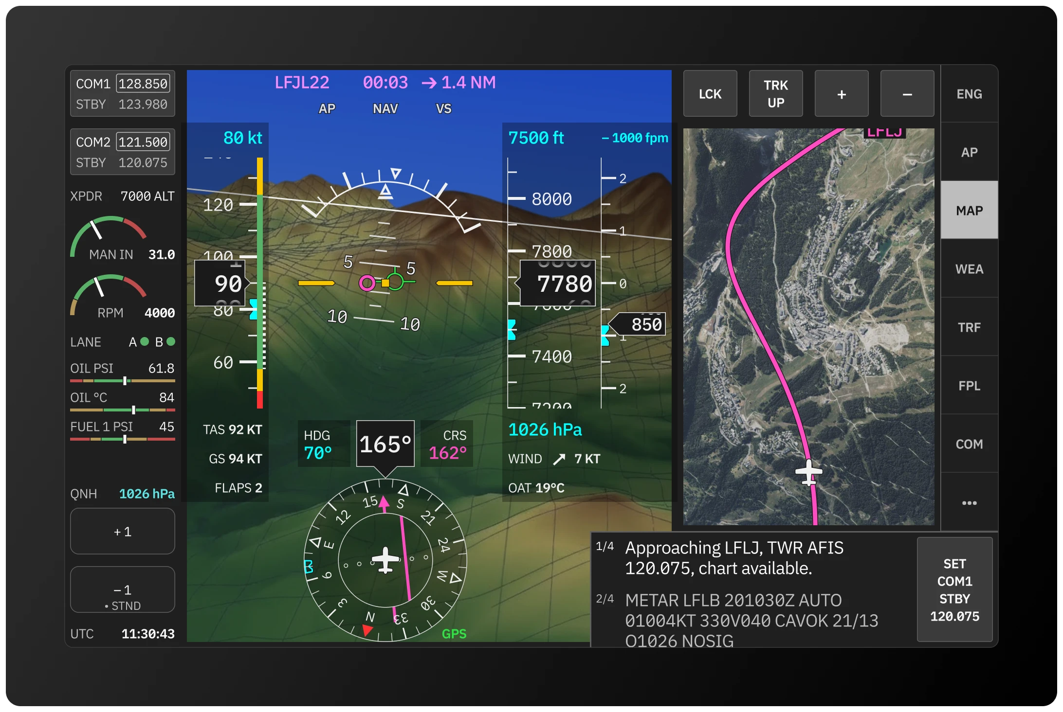
The notifications strip (ECAM) occupies a fixed, non-negotiable position at the bottom of the display. It is visible even when empty — its consistent presence builds the spatial memory that makes a sudden warning immediately noticeable.
In normal operation it surfaces contextual flight information: frequency changes when entering a new FIR, METAR and NOTAM data, tank switch reminders.
When something requires immediate attention, the strip escalates. Critical warnings appear in high-contrast red, and the related UI elements across the display are marked to match — the pilot knows not just that something is wrong, but where to look.
Conclusion
This is a speculative project, but it addresses the real problems. The experimental aviation market is exactly where they can be tackled without waiting a decade for certification cycles to catch up.
The goal is to provide a more readable, visually cleaner cockpit. Built on the same conventions pilots already trust, stripped of the visual noise that accumulated around them over decades.